-
5-minute read
-
21st October 2020
How to Create a Fillable Form in Microsoft Word
Did you know that you can create an interactive form in Microsoft Word? To do this, you’ll need to use the “Developer” tab. And in this post, we’re looking at how to add this tab to the main ribbon in Microsoft Word, plus a few key controls you can use to make a fillable form.
How to Find the Developer Tab
Fillable forms are perfect for collating standardized information. And to create one in Microsoft Word, you’ll need to add the developer tab:
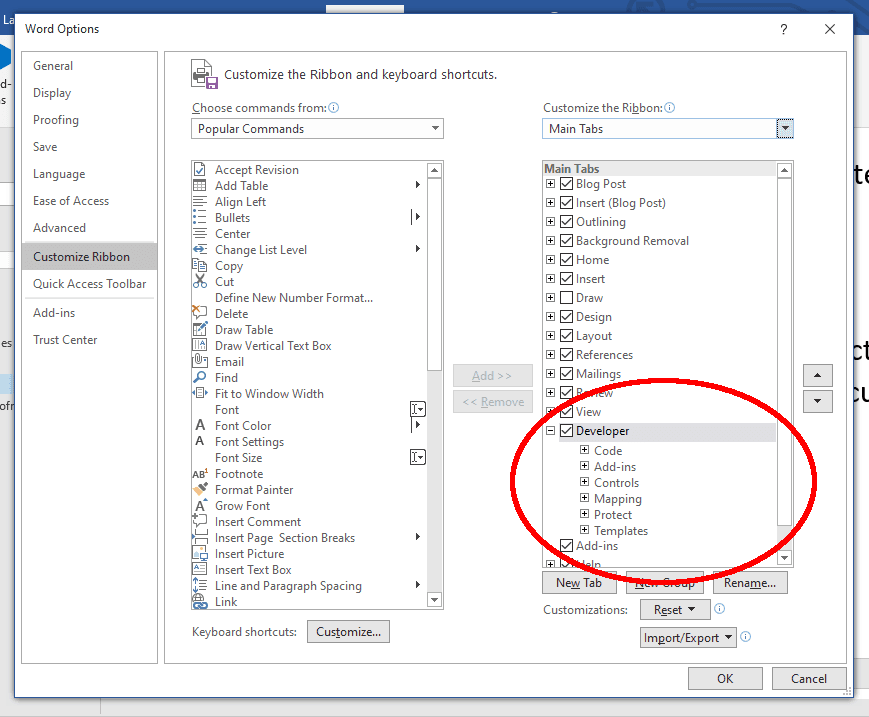
- If you’re using Word for Windows, go to File > Options > Customize Ribbon. Alternatively, if you’re a Mac user, go to Word > Preferences > Ribbon and Toolbar > Customize the Ribbon > Main Tabs.
- In the Main Tabs section, find and select the Developer check box.
- Click OK (or Save on Mac computers) to add the tab to the ribbon.
When you select this tab, you’ll see a variety of options, including for macros and add-ins. Here, though, we’re going to focus on five key tools:
- Text boxes (i.e., fields in which users can type freely)
- Check boxes (i.e., options that users can select or deselect)
- Dropdown lists (i.e., a menu with options the user can select from
- Date pickers (i.e., a menu that lets users select a date)
- Picture controls (i.e., a field that lets users quickly add an image)
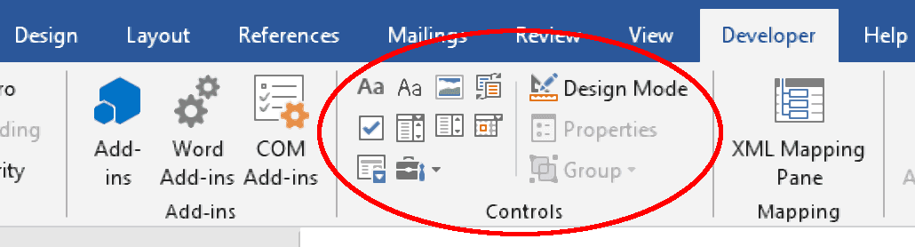
Read on below to find out how each of these controls works.
1. Text Boxes
Text boxes allow a user to type their own responses, so they’re most useful for fields with a wide range of possible answers (e.g., names, addresses).
You have two options for adding a text box via the Developer tab: Rich Text Content Control and Plain Text Content Control. The rich text version will let the user format individual words or characters in their response, but the plain text option will be adequate in most cases.
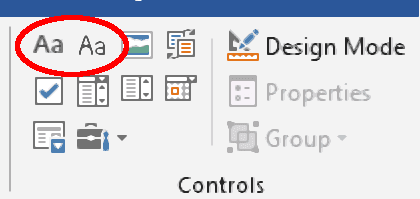
In either case, clicking these buttons will add a default text box.
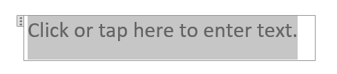
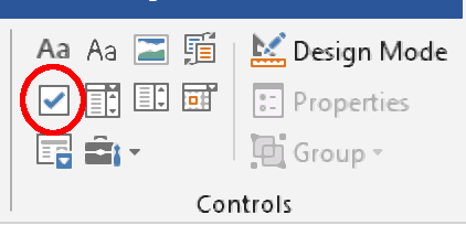
To customize the default text, click Design Mode in the Developer tab. This will let you type your own instructions in text boxes. And when you’re finished customizing the text box, deselect Design Mode to exit.
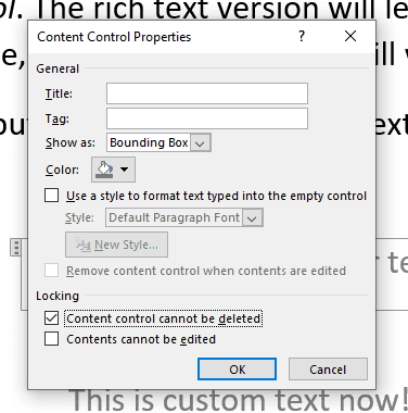
For more customization, you can also select the text box you want to edit, then click Properties in the Developer tab. Here, you can:
- Give the content control a name and tag.
- Control the style of the field and text within it.
- Lock the field so it can’t be deleted or so its contents can’t be edited.
You’ll be able to do the above for all the following controls, too.
2. Check Boxes
To add a check box, click the Check Box Content Control option.
You can then add text before or after the check box to label it on the form.

As well as the standard options noted for text boxes above, if you click Properties after selecting a check box, you will be able to customize the image used for the “Checked” and “Unchecked” symbols.
3. Dropdown Lists and Combo Boxes
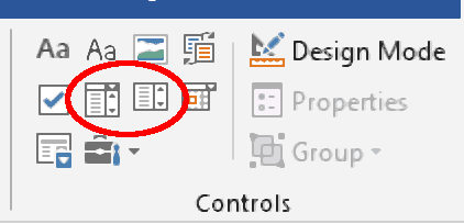
For fields with a limited set of options, use a dropdown list. To do this:
- Select where you want to add a dropdown list with the cursor.
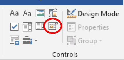
- Click Drop-Down List Content Control in the Developer tab.
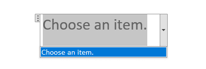
This will add a default dropdown list in the place selected, as shown below.
Find this useful?
Subscribe to our newsletter and get writing tips from our editors straight to your inbox.
Subscribe to Beyond the Margins and get your monthly fix of editorial strategy, workflow tips, and real-world examples from content leaders.
You’ll then need to click Properties, where you can add items. To do this, click Add… in the Drop-Down List Properties section, then add the item in the Display Name field (you can also designate a value for each item here, but these are only important if you’re using VBA).
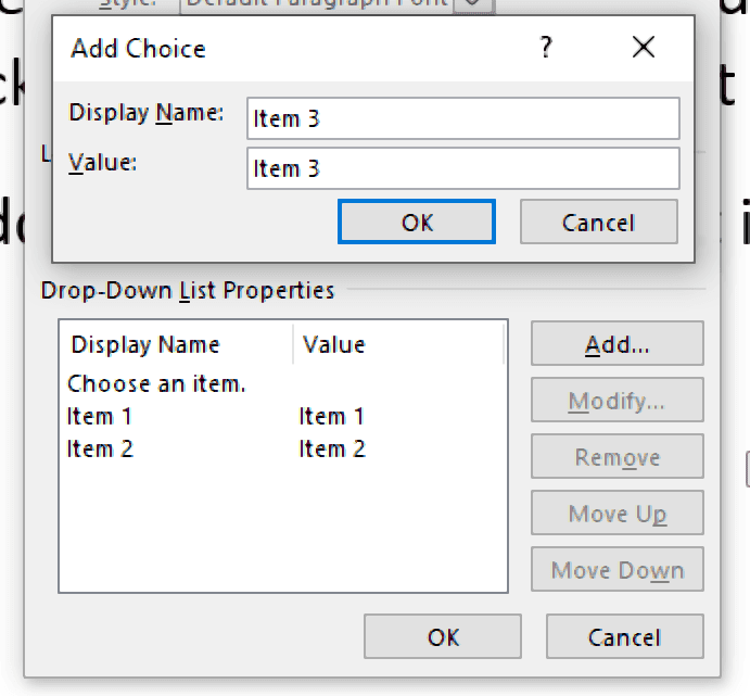
You can also remove or modify list items via these options. When you’re done, click OK and the items will be selectable from the list.
For more flexibility, use a Combo Box Content Control. This works like a dropdown list, but users can also type into it to give a custom answer.
4. Date Pickers
If your form includes a field for dates, use the Date Picker Content Control.
The user can then click the down arrow on the date field and select a date.
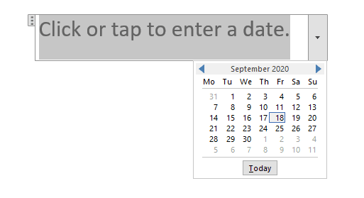
As well as the standard customization options, selecting a date field and clicking the Properties menu will let you set the date format.
5. Picture Control
If you want users to be able to add a picture to a form, you can use the Picture Content Control option shown below.
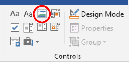
Clicking this adds a default blank picture field.
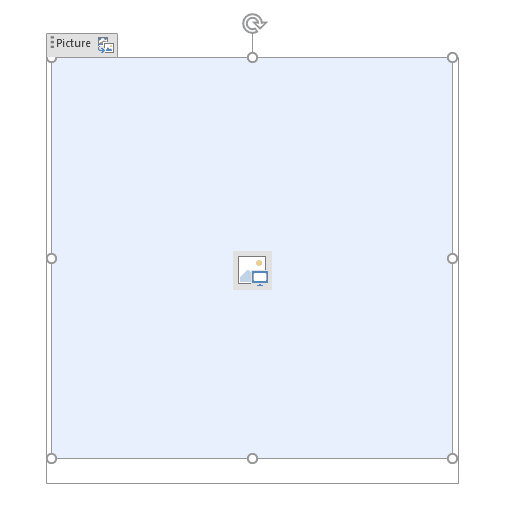
The user can then click the picture icon in this field, which opens a menu where they can select an image from their computer or the internet.
Fillable Form Presentation and Proofreading
To make sure your fillable form looks good, it helps to place fields in a table.
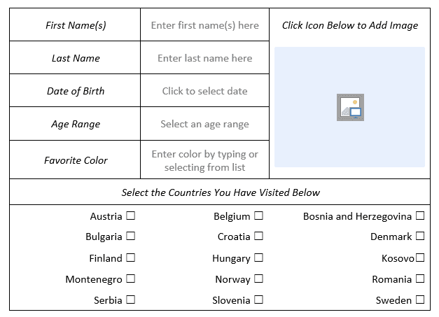
This will also let you label all fields clearly, making the form easy to use.
Typos in official documents like forms will look unprofessional and could cause confusion, though. So, to make sure your fillable forms are always error free, why not try our business proofreading services?
Sign up for a free proofreading trial today to find out more.